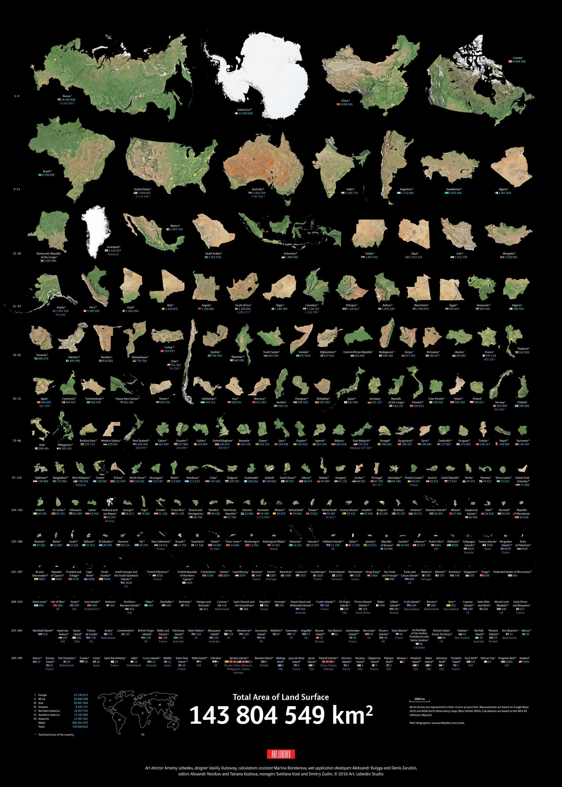
The Largest To Smallest Landmasses In The World, Visualized
One of the biggest drawbacks of the Mercator projection, the standard map projection for navigation, is that it distorts the true sizes of landmasses. So if you're curious about what the true size of each country around the world is, here's a handy visualization created by Art. Lebedev Studio and shared by Reddit user gabydrt that ranks countries by their measured land surface area.
From a single large chunk to a minuscule dot of earth, here's what each country's landmass looks like in isolation. You can see a full-sized image of the infographic here.

The four largest landmasses in the world are each on different continents. Russia, the clear leader, is followed by Antarctica, China and Canada. The US ranks sixth in terms of landmass size, trailing closely behind Brazil.

And broken down continentally, Asia leads in surface area and is slightly larger than Africa. Oceania has the least amount of surface area by a considerable margin.
[Via Reddit]

